Feature #17442
open
Added by Krzysztof Putyra 7 months ago.
Updated 4 months ago.
Description
Overview of the problem
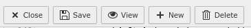
The current arrangement
[save][close] [delete] [new] is flawed: it makes people afraid to click "close", because the impression is that the button deletes data. This is caused by how our brain processes this information:
- the two buttons are next to each other with icons suggesting opposite actions
- opposite action to "safe" is "delete" ("don't safe" is no action)
- close button is normally the last one in a group, so our brain does not expect it at the current position
Moreover, because [save] and [close] are next to each other and [delete] is separated, the brain ignores [delete] when looking at [close] and tries to make connection only with [save]. This could be improved by placing [delete] between [safe] and [close]
An alternate arrangement
[safe] [new][delete] [close]
- [close] is the last button
- [delete] does not touch [safe], which prevents accidental clicks
- [delete] is between [safe] and [close] to prevent the brain making a connection between these two buttons
- choosing for [safe] an icon related to [delete] instead of a tick may improve the situation as well
Files
Having [close] last: I like it, because its what users are used to from other applications.
I did generally enjoy having [save][close] next to each other, because they are related and sometimes you want to do both right after each other. I don't think it's that important, though.
I think rearranging the buttons like suggested could help a little.
Perhaps a buttonless 'x' for closing would seem more recognizable.
A completely different approach: For Save and Close/Discard I think a solution like in the following picture would be most intuitive.
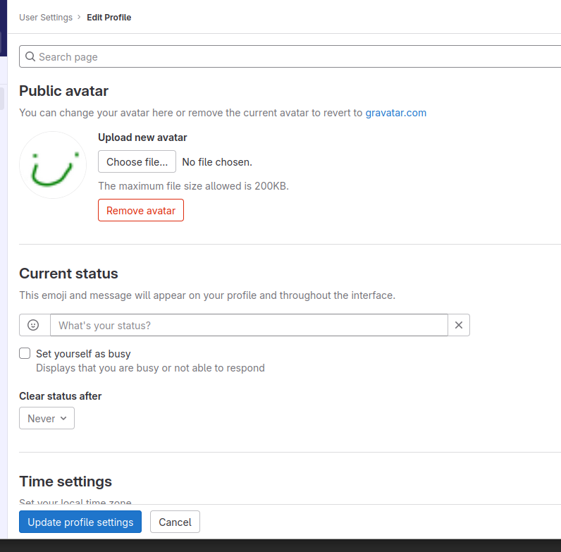
(Example from gitlab "Edit Profile" Form. The control buttons are at the bottom, but always visible because sticky.)
In my opinion, the other control Buttons (New, Delete, Debug Buttons) could also stick to the bottom.
A good time to try this or play around with it might be when implementing Boostrap5Renderer.
Ohh, topic feels like opening Pandoras box ;-)
- Kris suggestion [safe] [new][delete] [close] is fine for me.
- Philipp is right too, but we should discuss this in deep, maybe together with BS5 -
Philipp Gröbelbauer Maybe you can make a ticket "BS5 list 'suggestions / topics / discuss'"?
Enis: good point that safe & close are often used one after another. The problem is with the perception of them, though. I'm OK for it if we drop icons for text, as Phillip suggests. Otherwise the problem remains.
Phillip: separating buttons completely into save|close and new|delete|make-me-sandwitch might be the right approach. I wasn't brave enough for such a big revolution in the layout!
For me personally the easiest approach would be to add text to the buttons to make it clear what their function is: e.g. typo3
Obviously the buttons would double in size but I don't think that is a problem. It might be worth considering changing the check icon to a floppy disk though ;)
As far as positioning goes, having Save and Close next to each other makes sense to me and seems right. But I'm open to being convinced otherwise.
- Related to Feature #17466: BS5 list 'suggestions / topics / discuss' added
- Target version changed from 411 to 24.10.0
Also available in: Atom
PDF

 Updated by Elias Villiger
  Updated by Philipp Gröbelbauer
  Updated by Carsten Rose
  Updated by Krzysztof Putyra
  Updated by Jan Haller